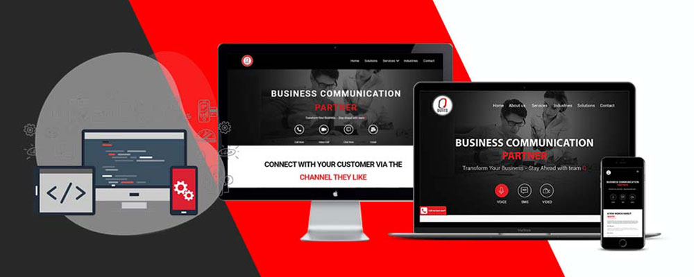
The growing usage of internet on mobile devices has led to substantial changes in web design. Websites are to be designed in such a way that users can handle them with ease. A responsive web design satisfies this necessity. A website with responsive design adapts to the size of the user screen. Whether it be mobile, smartphone, or even a tablet, your website will appear the same in all.
Over the years, the need for a responsive web design has assumed greater significance. This is mainly due to the rise in the use of devices other than desktops. Besides, half of the worldwide website traffic comes from mobile devices. Thus it is essential to optimize the web design to suit the user and his device. This is where QUIITS comes into action.
Earlier, designers had to create two versions of one website; one for desktop and the other for mobile devices. A responsive design eliminates this type of design by accommodating different screens sizes. It lets readers go through the text without any screen zooming or pinching. There is no need for horizontal scrolling as well.
Moreover, Google has introduced mobile-first indexing. It ranks the mobile versions of web pages and not the desktop version, thus encouraging more websites to become mobile-friendly.
A bad web design costs much to companies since 40% of visitors go to a competitor’s site after a poor mobile experience. It leads to greater chances of lead loss and sales. An optimal browsing experience is thus important for businesses to rank above their competitors. The flexible layout of responsive website ensures a seamless experience across multiple devices, thus enhancing website visibility on search engines.
Why responsive design is essential for businesses
With responsive web design, businesses will be able to reach out to more customers who are largely mobile users. Moreover, a consistent web experience will make the users stick to your business. This increases lead generation and conversion rates.
Customer tracking, analytics, and reporting across multiple channels can be done at one place, thereby reducing cost and saving time. A responsive site load faster, thereby reducing bounce rates. It also results in high web ranking.
QUIITS, the leading web development company in the UK, creates the best responsive web design for your business. We make sure that your website is best ranked and is flexible across all screen sizes. Visit https://quiits.com/ for more details.