A web development company in UK was hired to help with the design of a responsive website for a business news outlet. The company took an attentive and collaborative approach, working with a team of experts to create a better user experience for visitors. The new website is easier to navigate on any device, from desktop computers to mobile phones. As a result, users are able to find the news they’re looking for faster and more easily. Additionally, the website’s design is more modern and visually appealing. Overall, the redesign has been a success and has helped to improve traffic and engagement. If you’re interested in redesigning your website, be sure to contact Quiits – the leading web development company in UK for assistance. They will be able to help you create a website that looks great and functions well on all devices.
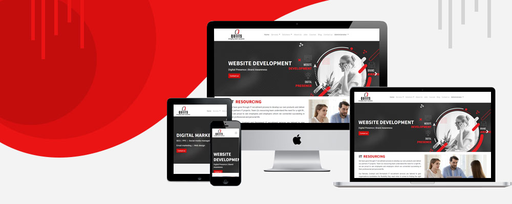
Responsive web design is a great way to improve your website’s usability and appearance. If you’re interested in learning more about it, be sure to check out our guide on the topic. In it, you’ll find tips on how to create a website that looks great and functions well on all devices.
Responsive web design is a growing trend in web development that aims to create websites that can adapt to any screen size. This is done by using flexible grids and media queries to change the layout of a website based on the width of the screen. As more and more people are using mobile devices to access the internet, responsive web design has become increasingly important. If your website isn’t responsive, it will likely look bad on smaller screens and could be difficult to use. In the past, it was common to design different versions of a website for different screen sizes. However, this can be expensive and time-consuming, and it’s difficult to keep track of all the different versions. With responsive web design, you only need to design one website that will adapt to any screen size. This makes it easier for users to navigate and for you to maintain. If you’re interested in creating a responsive website, be sure to check out our guide on the topic. In it, you’ll find tips on how to get started and how to create a website that looks great and functions well on all devices.
Responsive web design (RWD) is an approach to web design that makes web pages render well on a variety of devices and screen sizes. RWD uses flexible grids and media queries to adapt the layout of a web page to the width of the device it is being viewed on. This technique has become more important as the number of people accessing the web from mobile devices has increased. If your website isn’t responsive, it will likely look bad on smaller screens and could be difficult to use. In contrast, a responsive website will adapt to any screen size and will look good on all devices.
Creating a responsive website can be a great way to improve your web design. By using flexible grids and media queries, you can make your website look good on any device. This is important, as more and more people are accessing the web from mobile devices.Start writing here…